What fonts does this website use? https://cel.cs.brown.edu/pa…
I'll look up the stored font observations for that page's origin and path. Let me check whether that hostname exists in storage and in what form. No saved captures exist for that…
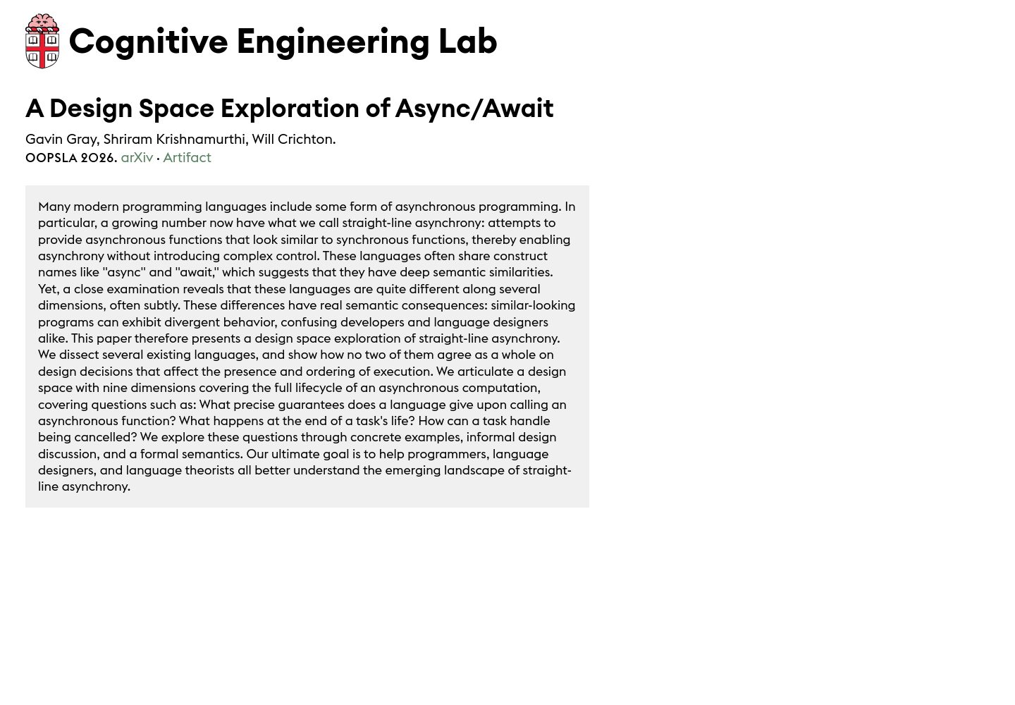
What fonts does this website use? https://cel.cs.brown.edu/paper/a-design-space-exploration-of-aa/
I'll look up the stored font observations for that page's origin and path.
Let me check whether that hostname exists in storage and in what form.
No saved captures exist for that domain, so I'll inspect the live page and read its font declarations.
The batched identity lookup came back empty, so let me check how those family names are represented.
Two typefaces, both custom Euclid cuts, self-hosted as WOFF2 from /assets/:
| Where | Family | Weight | Size / line-height |
|---|---|---|---|
body, article copy (div, span) | Euclid Flex | 400 | 18px / 23.4px, with running text at 19.8px / 25.74px |
abbr (small caps-style labels) | Euclid Flex | 500 | 17.82px, letter-spacing 0.7128px |
h1 (paper title) | Euclid Circular A | 600 | 36px / 39.6px |
| Large header link (site title/logo link) | Euclid Circular A | 700 | 48px / 62.4px |
| In-text links | Euclid Flex | 400 | 19.8px / 25.74px, green rgb(90, 131, 100) |
Both stacks declare only a generic fallback — "Euclid Flex", Sans-serif and "Euclid Circular A", Sans-serif — so if the fonts fail there is no designed substitute.
A note on coverage: this domain has no saved captures in the corpus, so the above comes from a live render of the page (fonts reported ready, one stylesheet captured, zero stylesheet failures and zero blocked resources), not from a stored analysis.
Below are previews for the two faces. Neither is in the preview catalogue, so those rows are marked unavailable rather than filled with a lookalike; the catalogue does hold Euclid Circular B, a sibling cut from the same family — useful to see the flavour, but it is *not* the font this page uses.
Typefaces declared on the Async/Await design-space paper page
- Euclid Flex
- Euclid Circular A
- Euclid Circular B
If you want, I can pull the actual font files from that page and identify them from the binaries, or compare the page's typographic system against saved academic-paper sites in the corpus.
Compare its type system with other academic paper sites in the corpus
I'll pull the target page's type data fresh, then find comparable academic-paper captures in the corpus.
Now let me find academic paper pages across the corpus and pull their font declarations.
The font-join returned nothing for those captures, so let me verify which stored relations hold font observations.
Font observations exist in the corpus, just not for those captures. Let me check the academic captures directly and learn the text-style fields.
Now let me pull measured text styles and role structure for the comparable academic captures.
Now let me ground the target page's own type data and resolve font identities for previews.
Let me compute the type-scale ratios precisely across the set.
The Brown page has the most reductive type system of any academic page in the corpus — and it inverts the body/meta hierarchy that every comparable page follows
Coverage and evidence type. The target page is a live render (fonts ready, one stylesheet, zero failures, full-page captured at 1440px). For the comparison I found 11 saved academic-paper captures, but the corpus stores two different grades of font evidence and they are not interchangeable: only the arXiv HTML paper and the ScienceDirect journal page carry *positively observed* declarations from a live measurement. JSTOR, Nature Aging, Science Advances, Apple's ML research page, Google Research, OpenReview, Perplexity Research and Thinking Machines Lab carry *historical, family-level attributions* — useful for naming the family, weaker on role and weight. I've labelled each row below.
| Academic page | Families (evidence) | Body text | Display step | Body leading |
|---|---|---|---|---|
| cel.cs.brown.edu paper page | Euclid Flex + Euclid Circular A (observed) | 18px / 400 | 36px / 600 h1; 48px / 700 site title | 1.30 |
| arXiv HTML paper | Rival-sans + IBM Plex Sans + Arial + system (observed) | 16px / 300 | 27.2px / 400; 22.4px / 700 | 1.50 |
| ScienceDirect journal page | ElsevierSans + ElsevierGulliver + Helvetica + system (observed) | 16px / 400 (14px secondary) | 32px / 400–500; 19.2px serif | 1.50 |
| Apple ML Research paper | SF Pro (historical) | 17px / 400 | 40px / 700 | 1.47 |
| Google Research | Google Sans Flex + system (historical) | 17.5px / 400 | 42px / 450; 98px / 450 | 1.45 |
| Nature Aging | Harding + Times + system (historical) | 18px / 400 | 32px / 700 | 1.76 |
| Science Advances | Roboto (historical) | 16px / 400 | 36px / 700 | 1.50 |
| Thinking Machines Lab | GT America + Iowan Old Style BT + Chakra Petch (historical) | 17px / 400 | 57.8px / 400 | 1.60 |
| OpenReview forum | Helvetica Neue + Noto Sans + system (historical) | 14px / 400 | 34px / 700 | 1.43 |
| Perplexity Research | GT Canon VF + GT Mono + Berkeley Mono (historical) | 12px / 400 | 56px / 900 | — |
JSTOR's article page carries GT America, but no size or weight data was retained, so it can only be compared by family.
1. The reading text is the smallest thing on the page
The abstract runs at 18px, while the byline, venue and arXiv/Artifact links run at 19.8px — verified by the character counts behind each style (1,523 characters of prose at 18px; 44, 8 and 5 characters at 19.8px, matching the author list and the two links). The only smaller tier is the <abbr> label at 17.82px.
Every comparable inverts this. OpenReview runs body 14px against 12px meta; ScienceDirect 16px against 14px and 11px; arXiv's HTML paper 16px against 13px IBM Plex Sans; Apple 17px against 14.11px; Thinking Machines 17px against 16, 14 and 13px; Science Advances 16px against 14, 12 and 10px. On the Brown page the paper's argument is set a step *below* its furniture. For a page whose whole job is to get a paper read, that is the most consequential typographic choice on it — the fix is to make the abstract the largest text tier after the title, and demote the byline block.
2. Tightest leading in the set, on the largest body size
At 18px with 23.4px line-height, the target's leading ratio is 1.30. No comparable goes below 1.43, and the median is around 1.50. Nature Aging — also 18px, and the only other page running body that large — uses 1.76, roughly a third more air per line. This is visible in the render: the abstract lines sit close together relative to the type size. Combined with a measure that runs most of the grey panel's width, this is the page least optimised for sustained reading of the ten pages measured.
3. Two families, one superfamily, no serif, no system escape hatch
The page is the only one in the set with zero serif and zero system-font fallback. Its stack is literally "Euclid Flex", Sans-serif and "Euclid Circular A", Sans-serif — no -apple-system, no Helvetica, no Arial. Every academic page here keeps a system route: arXiv declares -apple-system and Arial, ScienceDirect -apple-system and Helvetica, OpenReview -apple-system and Noto Sans. The nearest stylistic cousin is Apple's ML research page (SF Pro alone) — but that is a system family with a broad chain beneath it. On the Brown page, if the four self-hosted WOFF2 files fail, both optical cuts collapse to the same Arial/Helvetica metrics and the entire system disappears. That is a one-line fix with outsized resilience value.
4. The scale is compressed, and the leading ratios are internally inconsistent
The paper title is 36px against 18px body — exactly 2.00×, lower than OpenReview (2.43×), Science Advances (2.25×), Apple (2.35×), Google Research (2.40×) and Thinking Machines (3.40×). Combined with the fact that the page's largest type is a 48px *lab* name rather than anything about the paper, almost none of the display hierarchy is spent on the paper itself. The two display cuts also disagree on leading: the 48px site title gets 1.30, while the smaller 36px h1 is set tighter at 1.10 — backwards from the usual relationship, where the largest type takes the tightest leading.
5. Weight strategy: conventional, where the genre has drifted to extremes
The target uses a tidy 4-step ladder — 400 and 500 for text, 600 and 700 for display. The arXiv HTML paper, the closest genre sibling, does something much more contemporary and much less safe: a 300-weight body at 16px with 1.50 leading and a 400-weight title, reserving 700 for inline emphasis. Perplexity pushes the other way to 900, and Google Research sits a variable axis at 450. Brown's 400/500/600/700 is the most conservative weight plan of the set, and the reason its system reads as "brand design applied to a paper" rather than "paper design."
6. The one genuinely product-specific move
The <abbr> treatment — Euclid Flex 500 at 17.82px with 0.7128px letter-spacing (0.04em), effectively a small-caps-style label — has no counterpart in the measured styles of any comparable. It reads as an annotation layer for an HCI paper about language design, which is exactly the kind of decision that separates this page from a template. Worth protecting in any revision.
Corpus context
No other academic capture in the corpus uses any Euclid cut. Euclid Circular B — the sibling of the Circular A used here — does appear, but exclusively on commercial brand sites: Cricut, MetaMask, 80 Level and Kree8. So this is a Swiss Typefaces geometric-sans brand system imported wholesale into an academic context, with no academic precedent in the collection. That is what makes the page distinctive, and equally what makes its metadata-over-body priority read as borrowed from marketing rather than from scholarship.
Type systems across academic paper pages
One caveat on scope: I can compare text styles like-for-like across these pages, but the corpus doesn't retain column-width measurements for the comparables, so the Brown page's measure is the one dimension I judged from the render rather than against stored equivalents.
Want me to turn this into a concrete type-scale revision for the page — a corrected body/meta hierarchy, leading values and a fallback stack — or dig into the two captures with full positive evidence (arXiv HTML and ScienceDirect) for a closer side-by-side?