give me feedback for diffui.ai
diffui.ai is trying to persuade designers and developers to use a cleaner AI-to-UI workflow . The strongest choice is its warm editorial direction, but the current page has a seri…
give me feedback for diffui.ai
diffui.ai is trying to persuade designers and developers to use a cleaner AI-to-UI workflow. The strongest choice is its warm editorial direction, but the current page has a serious structural problem: the opening experience feels like one uncontrolled content column rather than a deliberate product story.
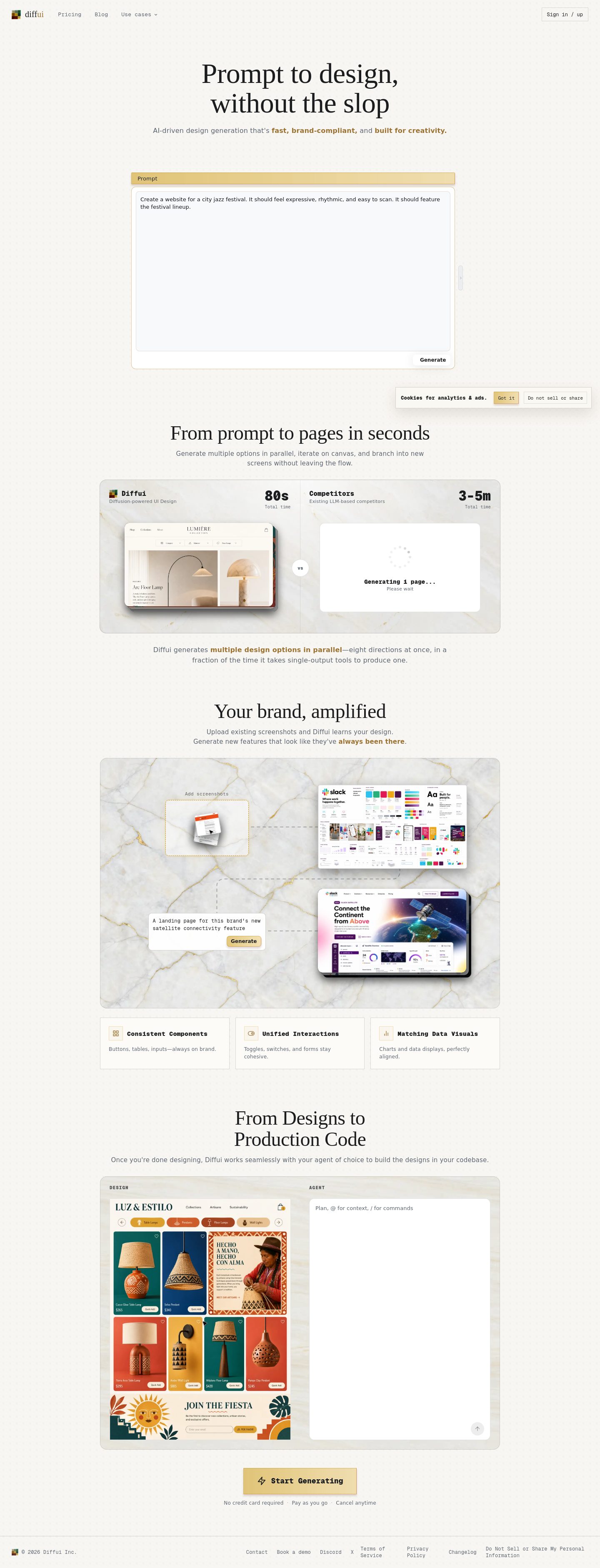
Captured pages
What works
- The premise is concise. “Prompt to design, without the slop” is sharper than a generic “AI-powered design platform” claim.
- The cream-and-ink foundation feels calmer and more editorial than the usual dark AI landing page. The current rendered body colors are
#f8f6f2and#1a1c1e.
Colors
#f8f6f2#1a1c1e
- The page avoids several tired AI effects. There is no detected glow, gradient treatment, broad shadow system, or excessive glass-card styling. That restraint is worth keeping.
Priority issues
1. Fix the opening layout first
The desktop capture reports an opening column around 3,763px tall beside a 51px sibling; on mobile, the main column extends to the full 4,580px capture height. That makes the page feel structurally unfinished before the visitor can understand the product.
Change: Make the first viewport a contained product argument:
- Navigation and one primary action
- Short headline and supporting sentence
- A real prompt-to-interface example
- One compact proof point or “before / after” comparison
Do not let the hero immediately become a continuous document column. The Framer and Subframe references above are useful because they put the product workflow near the top instead of making the visitor infer it.
This is the first change to make.
[Image unavailable: diffui.ai mobile full-page review]
2. Show the product, not just the philosophy
The promise is about producing better UI, but the page needs to demonstrate what “better” means. A visitor should see the input and the resulting interface within seconds.
Change: Add one dominant, legible example:
- Left: a short design prompt
- Right: the generated interface
- Small annotations showing what Diffui changed: hierarchy, spacing, copy, component choice, or visual consistency
- A single CTA beneath it, such as “Try a prompt” or “See the difference”
The landing.services and Framer references are better models for this than a generic feature grid: they make the product’s output the hero.
3. Give the typography a more intentional hierarchy
The page currently relies primarily on a standard UI sans stack, with body text rendered around 16px / 400 and tight leading around 1.2. That makes the typography feel like application defaults rather than a deliberate identity.
Change: Use a clear display/body contrast and more generous reading rhythm:
- Display heading: 64–76px desktop, 42–50px mobile
- Supporting copy: 18px / 1.5
- Long-form body: 16–17px / 1.55
- Keep monospace restricted to prompt syntax, UI metadata, or diff annotations—not general marketing copy
The visual direction does not need a flashy typeface. It needs stronger scale, more line-height, and fewer paragraphs competing at the same level.
Proposed hierarchy for diffui.ai
- Type scale · Desktop display
- 64–76px / 1.05
- Type scale · Mobile display
- 42–50px / 1.08
- Type scale · Supporting copy
- 18px / 1.5
- Type scale · Long-form body
- 16–17px / 1.55
- Spacing · Mobile page gutter
- 20–24px
- Spacing · Hero content gap
- 32–48px
4. Turn the color palette into a product language
The cream background is a good foundation, but the page needs stronger semantic use of its accent colors. The visible palette includes muted teal, terracotta, ochre, navy, and brown tones; without clear roles, those colors risk reading as decoration.
Change: Assign them to Diffui-specific concepts:
- Terracotta: changed or rejected UI
- Teal: approved or improved UI
- Navy: technical metadata
- Ochre: prompt highlights
- Cream: canvas and workspace
- Dark ink: primary text and controls
That would make the color system explain the “diff” concept rather than merely make the page warmer.
5. Repair mobile reading conditions
The mobile capture places content extremely close to the viewport edge, and the tight line-height makes long sections feel compressed.
Change: Set a minimum 20–24px mobile gutter, cap text blocks at roughly 34–40 characters per line, and increase body leading to at least 1.45. Break long sections with screenshots, short labels, and visual comparisons instead of relying on uninterrupted text.
Contrast check
The page exposes exact body colors, but the retained text-level contrast observation was unavailable, so I won’t claim a WCAG ratio from those colors alone.
| Element | Foreground | Background | Size / weight | WCAG | AA | AAA | APCA |
|---|---|---|---|---|---|---|---|
| Body text | #1a1c1e | #f8f6f2 | 16px / 400 | Unresolved — exact contrast observation unavailable | Unresolved | Unresolved | Unresolved |
Vibe-coded appearance check
Overall visible-design verdict: mixed
Craft: weak Originality: mixed
| What you see | Kit or distinctive | Why it hurts |
|---|---|---|
| Warm cream canvas with dark ink | Neutral/editorial | Good foundation, but it needs a stronger Diffui-specific visual vocabulary. |
| Standard UI sans stack | Generic/default | Makes the product feel interchangeable with other AI tools. |
| Very long primary content column beside a tiny sibling column | Generic/default scaffolding | The page hierarchy collapses and the visitor cannot tell where the product story begins or ends. |
| Long text measure and content near the viewport edge | Generic/default | Reduces scanability, especially on mobile. |
| Tight 1.2 line-height | Generic/default | Makes explanatory copy feel denser than the product’s calm visual direction suggests. |
| No glow, gradient, or broad shadow treatment | Distinctive restraint | Keep this; it gives the page a chance to feel more considered than a typical AI landing page. |
The page should not become a louder SaaS template. It should become more demonstrative: one clear prompt, one visible transformation, one explanation of what Diffui improves, and a much more controlled reading path.